In this article, we examine the importance of page speed for a website, as well as how to measure and optimize it using Maya’s embedded reporting.
What is Page Speed?
When creating content and publishing websites, an important factor for any business to consider is undeniably the speed of its web pages. In general, Page speed captures the time it takes from the moment a user requests a page until the content is completely loaded on the device, and the page has become fully interactive. But in reality, Page Speed can’t be measured with just a single metric. On the contrary, it describes a variety of metrics, calculated in between. This happens because there are a lot of events that are happening in the background that affect speed, and each of them needs to be viewed or addressed separately.
For example, to tackle speed performance, Google has created the Speed Index metric, available through the PageSpeed Insights report, which measures how fast the content is visually populated, but there are also metrics measuring responsiveness like Interaction to Next Paint (INP), metrics for element loading time like First Contentful Paint (FCP) and Largest Contentful Paint (LCP) and others capturing different speed aspects that are meaningful to each business.
Why is Page Speed important?
1. SEO
- Site performance is an important factor in Google search rankings, especially on mobile devices.
- Slow page speed means that search engines can crawl fewer pages using their allocated crawl budget, and this could negatively affect the page indexation.
2. Lower Bounce rate & more time on the website
- Slower page response time results in an increase in page abandonment (source).
- Most participants would wait 6-10 seconds before they abandon pages. (source).
3. Better User Experience
- Of all the people surveyed, half said they’d be willing to give up animation and video for faster load times (source).
4. Good First Impression
- 79% of shoppers who are dissatisfied with website performance are less likely to buy from the same site again (source).
5. More Page Views
- A 1-second delay in page load time equals 11% fewer page views, a 16% decrease in customer satisfaction, and a 7% loss in conversions.
6. Higher Conversion Rate and Sales
- A site that loads in 1 second has a conversion rate 3x higher than a site that loads in 5 seconds. (source)
- Walmart found that for every 1-second improvement in page load time, conversions increased by 2% (source)
- Customers spend longer on a site and buy more in one purchase when the page load time is low.

Maya’s Page Speed Insights
Datasets
In Maya’s Page Speed report we use 3 different data sources to import metrics and create a complete overview of your Website performance. Each one of these sources has a different set of metrics to offer.
- Google Lighthouse Lab Data
- Google Chrome UX Report (CruX)
- Google Analytics Site Speed
Setup
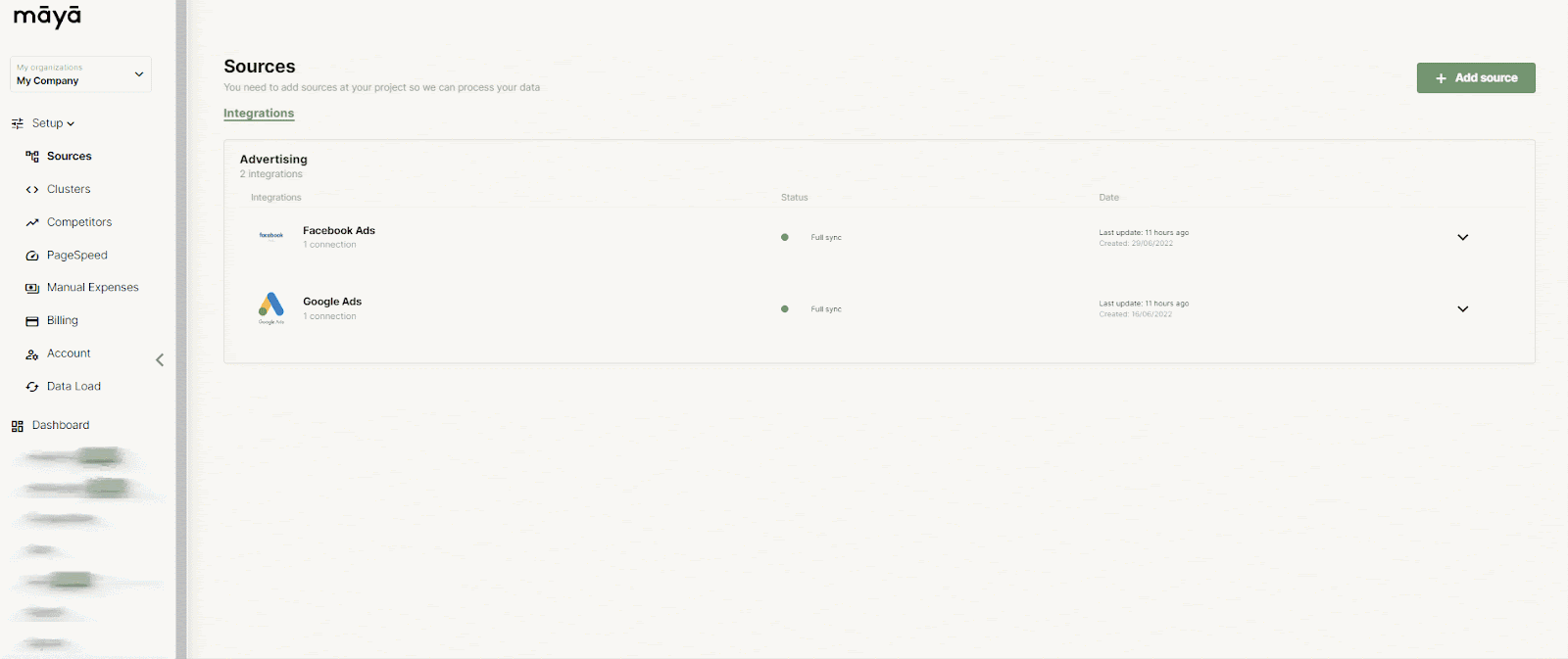
The first thing to do will be to add your URLs on the setup page. Maya uses these URLs to perform the Lighthouse speed test, and extract information from the CruX dataset concerning past user data (if available).
You can go to the Setup Panel > PageSpeed and there you will be able to add up to 10 URLs that you would like to monitor on the Page Speed Report:
Report Tabs
Below you will find a detailed description of each of the report tabs and their respective metrics and visualizations explanation.
01. Lighthouse – Lab Data
What is the dataset exactly and why are we examining it?
In the first tab, we examine Lighthouse Lab data. By lab data, we mean real-time measurements, within a consistent, controlled environment with predefined device and network settings, automatically set by Google. This offers reproducible results and debugging capabilities to help identify, isolate, and fix performance issues immediately. (source)
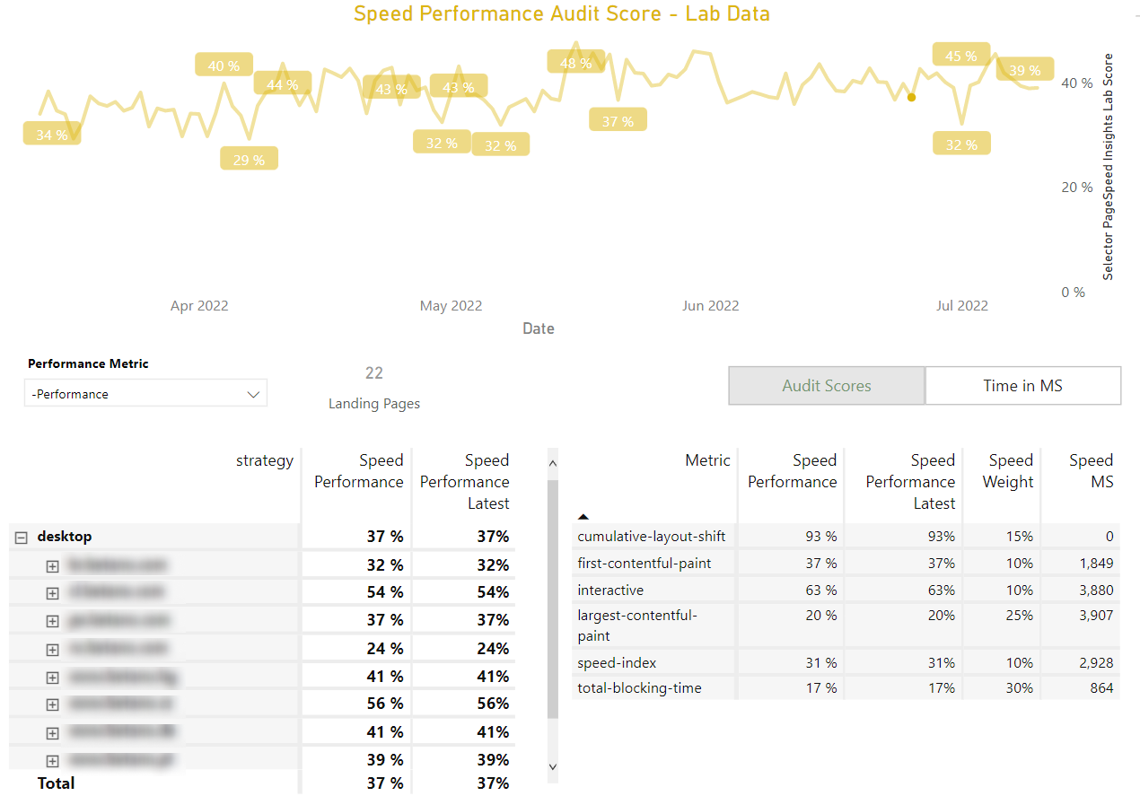
Line Chart Visualization
The first thing you will probably notice when accessing the Lighthouse Lab Data page, is the line chart on the top of the page. In this chart you can select the metrics provided by the Lighthouse service in two alternative formats, one as audit and the other one as time in MS. Below you can find detailed information about each one of them:
- Format tabs
- Audit Scores
Audit scores are represented by percentages for each individual metric score, as set by Google. You can also see a weighted average that represents an overall score for your pages.
- Time in MS
Time in MS measures the actual time in milliseconds, for each metric. Moreover, on the line chart, you will notice that there are two horizontal dotted lines (a red and a green one) that refer to an empirical evaluation of the metric in terms of time, of course. For example, if a landing page performance metric is displayed always above the red line level, it indicates that this page is considerably slow and we have to take actions to improve it.
Note: Both tabs contain the same metric, with the exception of the Performance metric which is only available in the audit tab.

- Metrics dropdown
- Cumulative Layout Shift (CLS)
- First Contentful Paint (FCP)
- Speed Index (SI)
- Largest Contentful Paint(LCP)
- Time to Interactive (TTI)
- Total Blocking Time (TBT)
- Performance (only as audit score): The Performance metric is an average score that takes into account all other metrics, by an empirical weighting factor, set by Google and provides the overview of how well the page is performing during a set interval.
Note: Performance is the default metric displayed whenever you want to do a page speed test.
Table Views
There are also two separate table visualizations for the above metrics on the report to drill down further into your data.
- Strategy/Device Table
On the Strategy Table view, you will be able to examine your data from a device point of view, then by URL domain and finally by specific page. On the columns, you can compare your pages’ average speed performance to your latest scores (previous day results).
- Metric Table
On the Metric Table view, you can see for each metric:
- Its average performance
- the latest metric performance
- its weighting factor on the performance metric
- and finally its actual time in milliseconds (if applicable).
01b. Lighthouse – Lab Data Audit Type
On this report page, you will be able to examine 4 different audit charts, extracted from the Lighthouse Lab Data. However, in this case, you can see historic score measurements for all sections of the performance tab, as well as the latest scores for each one of them for reference.
Performance
On the Performance Audit chart, we can have a holistic view of the performance metrics that we covered on the previous tab.
Accessibility
The Accessibility Audit chart concerns the webpage’s capacity to be accessible to all users and can also be operated by the most diverse range of users possible.
Best Practices
On the Best Practices Audit Chart, you can check your pages’ conformance to web best practices.
SEO
Finally, on the SEO Audit chart, you’ll be also able to examine your website’s ability to be indexed and ranked by search engines.
02. PageSpeed – User Data 28 days
What is the dataset exactly and why are we examining it?
The PageSpeed report page displays data from the Chrome User Experience Report (or CrUX for short) and is powered by real user measurement of key speed-related metrics captured on the Chrome browser. The metrics do not reflect real-time measurements (like in the Lighthouse report case). They reflect instead, average values captured from real users within the last 28 days (rolling average of 28 days).
Note: Not all pages may have available data to display.
Line Chart Visualization
For this page you can also visualize all your data in an insightful line chart, selecting for each case the format tab and the metric you need to analyze. Below you can find detailed information about each one of them:
- Format tabs
- Proportions
In the Proportions tab, you can see the proportions of a sample of users’ speed experience for the metric at hand. On the chart, you will notice that there are three lines:
- A red line that represents the proportion of users who had a bad experience on your page.
- A gray one for the ones that had an average experience.
- Finally, a green line for the users who had a good experience.
- User Averages in MS
User Averages in MS is the 28-day rolling average calculation of each metric, based on measurements from a sample of users using the Chrome browser. As in the case of the Lighthouse Lab Data chart, there are two dotted lines to indicate when a speed metric score is considered good or bad.
- Metrics dropdown menu:
Except for the Cumulative Layout Shift, the First Contentful Paint, and the Largest Contentful Paint metrics that were previously explained and are common between Lighthouse and CrUX, additional metrics offered from the CrUX dataset are:
Table Views
On this report page, we also have a Metric Table view, where we can see specifically for each metric its latest values and when they are considered high, average or low, for the proportion of users.
03. Analytics Speed – User Real-Time Data
What is the dataset exactly and why are we examining it?
The Analytics Speed dataset is extracted from Google Analytics and provides speed metrics for pages that are being tracked by the Analytics tracking code. Moreover, it analyzes user data in real-time, unlike the CrUX dataset that examines user data on a rolling average, as we covered in the previous section. The dataset contains information about a number of metrics for each landing page, device, browser, and even country for a sample of users.
Beware that depending on the filters you are using (e.g. specific page, device, browser, or country), different levels of sampling may occur, as you can see below the line chart of the page. Sampling concerns the average sampling occurring on a specific date range for the selected web pages
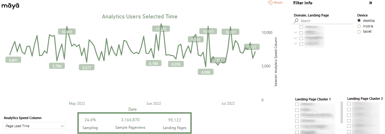
Line Chart Visualization
On the Line chart, you will be able to see the values over time for the metric at hand. The metrics provided by google analytics and which we examine in this case are presented below:
Metrics dropdown menu
- DOM Content Loaded Time
- DOM Interactive Time
- Domain Lookup Time
- Page Download Time
- Page Load Time
- Redirection Time
- Server Connection Time
- Server Response Time
Latest Captures vs latest period Comparison
Below the line chart, you will find for each metric its measurements, as captured in the latest time period, as well as a comparison of an all-time average capture. The all-time average can be adjusted to display the average of a set period in time, by using the date filter on the filter pane, for different use purposes. This comparison is displayed on the right side of each metric in a percentage form, in green (if it has improved) or red font color (if it has worsened).
Filter Pane
On every report tab, you will notice there’s a filter info panel to use in order to segment your data and monitor specific pages, domains, or even devices. Also, it’s extremely important to create Landing Page Clusters in the setup section. With Landing Page Clusters you will be able to group all of your pages by intent, content, or any other criterion for the purpose of the analysis.

Frequently Asked Questions
Numerous tools can help you measure accurately your website’s speed and overall performance. With Maya’s embedded report, you’ll be able to monitor your pages’ speed, based on valuable KPIs, and take actions to improve SEO, website visibility, user experience, conversion rate, etc.
A page that loads in under 3 seconds, can be crawled more easily by search engines which is good for indexation. Plus, site performance is an important factor in Google search rankings, especially on mobile devices.
Using the Lighthouse database, you can view and monitor your webpage’s performance in real-time. That means that you can see how a new release or bug fix immediately affects your website in a controlled and consistent environment.